

Oct
“Helvetica” from a Diversity Perspective
[responsivevoice_button voice=”UK English Female” buttontext=”Listen to Post”]
The past spring, AIGA DC we launched Inspire and Discuss, an informal session that aims to inspire creativity and foster open discussion on a broad range of topics, starting with the elephant in the room – diversity and its lack in the creative community” Much of what was discussed was very insightful and personal. Out of respect for those who attended, I will not put their thoughts on this blog. But I will put my thoughts on the movie to kick off the discussion, Helvetica.
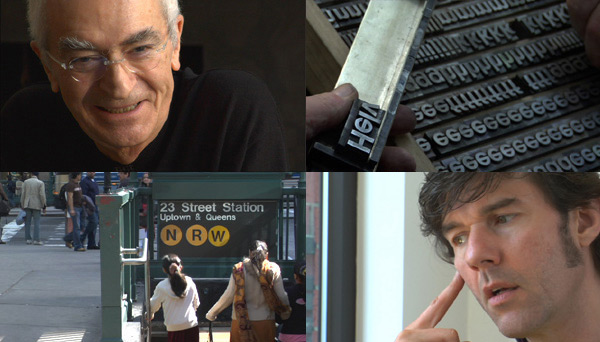
Click the video below to hear the trailer.
For a long time, I thought this was the best depiction of graphic design I had seen committed to camera. But the older, more experienced, more skilled, well-rounded, and critical I’ve become, the more I see the inherent problems with this documentary. I don’t completely hate Helvetica, nor do I completely love it. It sits in a grey area for me. But as Joan Morgan says, it’s time to “fuck with the greys.”
”I'm struck by how much punk, grunge, hiphop, disco, funk, jazz -- genres informed by White, Black, Latino, and Gay youth cultures -- influenced, yet profited by seemingly heteronormative white designers like Paula Scher, David Carson, and Saul Bass.
The Hubris of White Men in Design
The hubris of these white men is something to admire. It can be compelling and change our culture. But it’s limiting. Just listen to Michael Beirut’s take on Helvetica.
One of the problems with putting design in a historical context is that someone’s story gets lost. The other is that some people’s identities get ossified. What happens when the biggest thought leaders’ sensibilities are informed by Modernism?
Throughout the documentary, I hear words like universal and neutralism. Given Helvetica’s history — created by the Swiss and carefully marketed to certain communities, specifically to U.S. businessmen — I’m suspicious.

Which bring me to my other concern…
Helvetica is not Accessible
The typeface is largely English-language-oriented. What about Arabic, Chinese, Korean, or Japanese? And where is Braille? Is the intent of it’s clean lines and shapes translate across cultural perceptions of clean? This renders all claims of neutrality and universality, moot. And what of typeface design as it relates to government and nonprofit? What does it mean when the goal is not to sell a product or associate with a brand? This gets to deeper roots of language, culture, and society that are too often dismissed in docs. like Helvetica.
When Design Profits from Subcultures
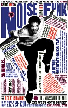
Poster designs for the Public Theater, designed by Paula Scher.

Fragile, Nine Inch Nails. Album cover design by David Carson.
Helvetica also covers designers who moved away from Modernism into Postmodernism and expressive type design. Paula Scher is a hippie and a revolutionary. David Carson absolutely informed much of my youth. I’m struck by how much punk, grunge, hiphop, disco, funk, jazz — genres informed by White, Black, Latino, and Gay youth cultures — influenced, yet profited by seemingly heteronormative white designers like Paula Scher, David Carson, and Saul Bass. I’m not suggesting some sort of cynical cultural appropriation has taken place. I’m saying that we, who are a part of that culture can and should profit from — and speak on behalf of — the very culture we produce.
Lella’s Wikipedia page in 2015 is mentioned in relation to her late husband Massimo.
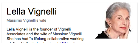
Much like Aperture #223, Vision & Justice, there are missed opportunities here. If I had my way, I still would’ve interviewed David Carson and Paula Scher. Their work heavily influenced my imagination as an angsty teen in the 90s. Instead I would’ve interviewed Lella Vignelli — an accomplished architect, furniture designer, and jewelry designer– often overlooked in favor of her husband Massimo. I would’ve also want to interview Archie Boston, and my own college professor Dr. Starmanda Bullock. She taught me that travel can inform my design eye, and that people all over the world — not just Europeans — have been creating sophisticated design solutions. Bodies speak. Let Brown bodies speak as design experts, not just racial issues. There’s more opportunity to connect art, music, film, fashion to design. Not just lay it on top as marketing. And it’s never sexy watching people design. We should accept that and move on.
Diversity is not just a matter of representation. It’s also about a diversity of thinking. If we really want to think about what makes design universal, accessible, modern, postmodern, or expressive, we need to reconcile with they way these ideas have been formed is deeply racist, ableist, and Western-focused. And if we want to unpack, dismantle, and ultimately reconstruct these ideas, we’ll need to be more diverse.