
Aug
The Papyrus Problem | Hating the Use of Everyday Design
[responsivevoice_button voice=”UK English Female” buttontext=”Listen to Post”]
When I started out in graphic design, I didn’t know how to explain to people what it is I actually do. One college professor stated very clearly, “We solve visual communication problems.”
People understand this response because it’s not interested in the last big company or campaign I worked on. Instead, I explain my value to society. Graphic design’s purpose is not simply to make the world prettier. But be relatable, accessible, and more understandable.
This also means not mocking the use of Papyrus or Comic Sans for some laughs.
”The entry fee to design requires being just bougie enough to forget about practicality.
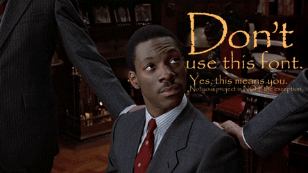
For the past few years, a phase of design critique has risen across the internet that openly mocks and ridicules popular desktop typefaces, particularly two: Comic Sans and Papyrus. Nevermind that, like Helvetica, these two typefaces also grew in popularity due to their widespread availability in Mac and PC operating systems. These critiques often fail to understand them in context. Comic Sans and Papyrus — with their weird x-heights and ends picked up from a pen — appeal to people, not just through social conditioning of “ethnic typography.” But because they appear the closest to something handwritten. If you’re a school administrator or church volunteer, and you don’t know how to digitize your own handwritten style, Papyrus and Comic Sans are understandable go-tos. I’ll be the first to say I don’t like making church fliers, and I wouldn’t use either of these typefaces (nor Helvetica) to make one. But talking down to people who do does none of us any favors.
”Graphic designers like to treat aesthetic solutions and social solutions like they're different. But they have more in common than we'd care to admit.
But solving visual communication problems doesn’t mean ignoring the implications of these “favorite font” conversations.
This isn’t about defending handwritten desktop typefaces. It’s about questioning a design discourse that either really likes something that everyday people use and quickly co-opts it, or really hates something that everyday people use with no considered context. The foundations of good design criticism — nuance, constructive feedback, informed cultural history, or deeper questions about purpose and intent — are seemingly lost.
This brings to mind “Everyday Use,” Alice Walker’s short story about a young African American woman who leaves her rural Southern past only to “rediscover it” upon returning home to visit her mother and younger sister, who both stayed behind. The short story covers themes of what gets to be valuable, and proximity to power in “discovery.”
This story also reflects the sensibility around everyday design that — regardless of race, gender, class, or language — isn’t always self-aware about its privilege. The entry fee to design requires being just bougie enough to forget about practicality.
”When we talk bad about someone using Papyrus, we forget that maybe it was used by someone who used it in the funeral program for her cousin who got shot a few days ago by the police.
There’s a struggle participating in a modern design discourse that feels it has to trade substantive critique of social issues for shallow aesthetic critique. While it’s good that we are increasingly willing to give more time and thought to design thinking to solve problems of gentrification, diversity, or police brutality, we are more reluctant to offer that same depth to a proposed redesign of the U.S. Constitution, or someone’s Dribbble account. Who asked to have these redesigns? Who even says a redesign is the solution? And why does all this stuff feel so redundant and half-baked?
And when we’re not doing that work, we openly mock everyday solutions without knowing who else is using them. When we talk bad about someone using Papyrus, we forget that maybe it was used by someone who used it in the funeral program for her cousin who got shot a few days ago by the police.
In an ever-increasing drive to feed the social media beast with content, it’s much easier to passively “like” or “share” something that looks good rather than ask if it was used by the target audience. It’s much easier to award something that adheres to our modernist and postmodernist sensibilities than ask how the people who used it felt about the product. It’s also sadly much easier to criticize someone’s design for using a less-than-chic typeface, regardless of how it was used.
If it seems like I’m having two different conversations, that’s my point. Graphic designers like to treat aesthetic solutions and social solutions like they’re different. But they have more in common than we’d care to admit. We need to get to the heart of these solutions as they combine, and ask ourselves did they help anyone besides ourselves.