
College Begins in Kindergarten Logo Design
College Begins in Kindergarten Logo Design
Description
[responsivevoice_button voice=”UK English Female” buttontext=”Listen to This”]
The Education Trust wanted to brand their slogan, “College Begins in Kindergarten” with a singular identity that would inspire our audience, yet consistently translate across different mediums.
Challenge #1: Producing a singular idea.
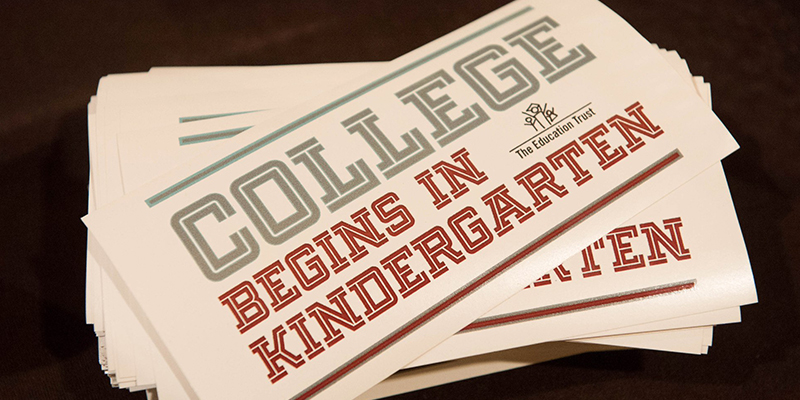
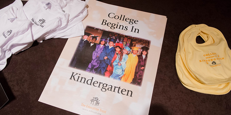
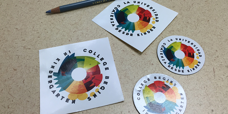
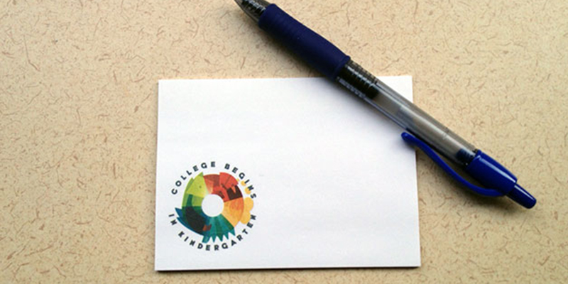
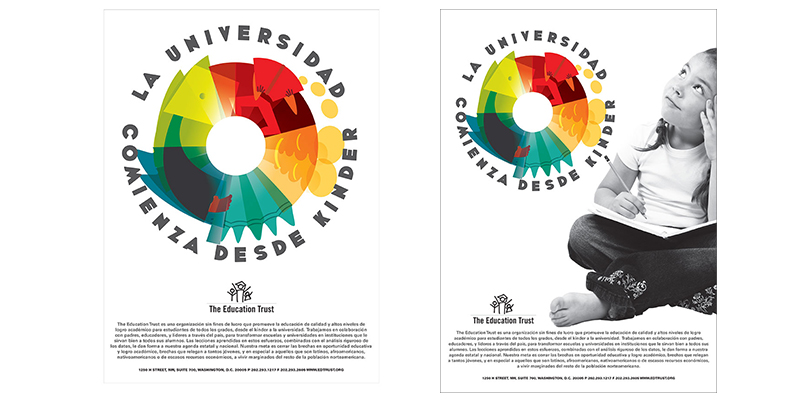
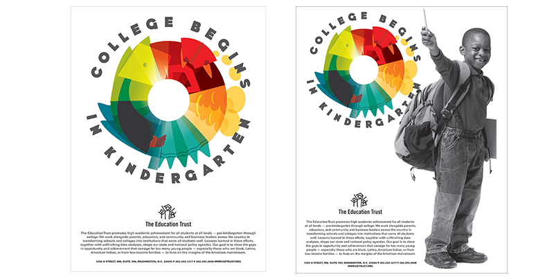
The Education Trust is a Washington, D.C.-based education advocacy organization working to close the achievement gap that separates low-income students and students of color from their more affluent and white peers. Our slogan, “College Begins in Kindergarten” is very popular among the teachers, counselors, and parents who know and rely on our work. But we were often using the slogan in various ways that weren’t unified. For example, we were using the slogan on a bumper sticker, but styled very differently than the poster. Also, the existing poster was dated and needed to be replaced. The goals of this project were to create a singular image that could replace existing merchandise and unify the various ways we use the popular slogan.
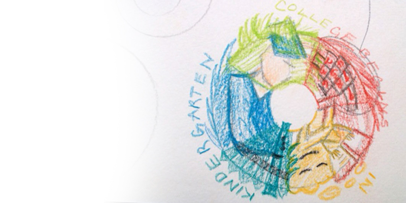
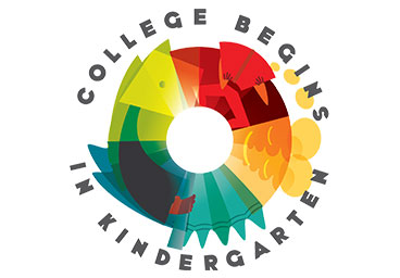
During an afternoon visit to the Smithsonian’s Freer Gallery, I was impressed by the continuous narrative in sculptures and ceramics that told a story in a cyclic manner. After my visit, I quickly put together a sketch. Our clients wanted a variation that also featured children. To avoid too many competing elements, I decided to present one child, enlarged, and in black and white.
Challenge #2: Breaking logo rules.
I wanted to challenge myself with this exercise by going against everything I’d been taught about logo design. It must be no more than two colors. It must translate to black and white. It must not use any extra styling elements. I wanted to try my hand at something detailed for a logo, yet abstract as art. Something lush with color and imaginative, but still clear to our audience.
Date
November 7, 2015
Categories
- Identity Design
- Illustration
- Poster Design