Select photography by Alexander Morozov


The Education Trust National Conference Branding, 2012-2014
The Education Trust National Conference Branding, 2012-2014
Description
[responsivevoice_button voice=”UK English Female” buttontext=”Listen to This”]
From 2012 to 2014 I developed the branding for The Education Trust’s annual national conference. That included the program book, signage and wayfinding, registration booth, cyber cafe, giveaways, and so much more.
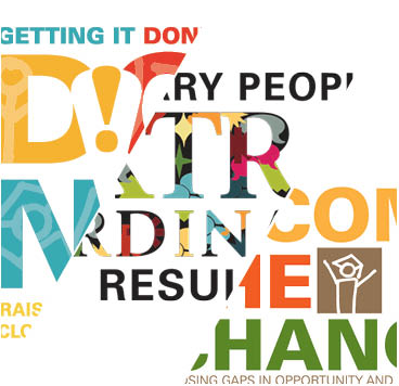
Challenge in 2012: Logo development
The concept for the logo was to be optimistic and find ways to integrate Ed Trust’s elements into the conference. I needed some kind of visual anchor to The Education Trust. This was the first time I took the symbols from Ed Trust’s logo and broke them up to create another logo.
-
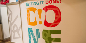
- Registration booth, 2012 National Conference, Photography by Alexander Morozov
-
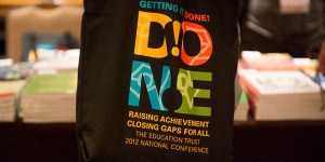
- Tote bag, 2012 National Conference, Photography by Alexander Morozov
-

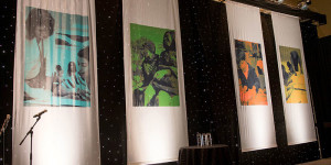
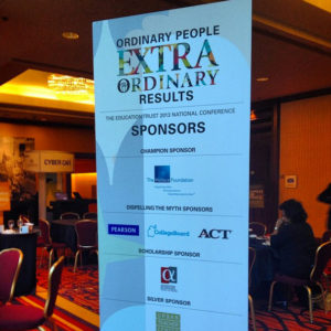
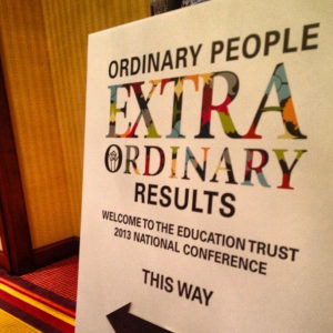
- Vertical banner, 2012 National Conference, Photography by Alexander Morozov
-
- Vertical banner, 2012 National Conference, Photography by Alexander Morozov
-
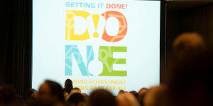
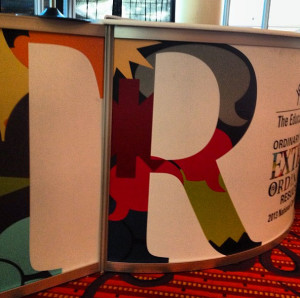
- Conference logo, 2012 National Conference, Photography by Alexander Morozov
-
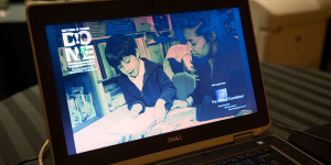
- Slideshow, 2012 National Conference, Photography by Alexander Morozov
-
- Staging, 2012 National Conference, Photography by Alexander Morozov
-
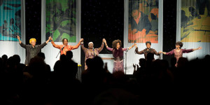
- Staging, 2012 National Conference, Photography by Alexander Morozov
Though successful, I felt the process could improve ahead of next year’s conference.
Challenge in 2013: Logo development and beyond
For all the use of Univers in our work, we forget the other, equally elegant typeface, ITC Giovanni. Transformed from everyday copy used as a decorative display font, it illustrates the word “extraordinary” in a remarkable way. The Ed Trust graduate is used, tying in a familiar symbol from our logo. Learning from the unpredictability of conference materials, I thought this time I would present what a logo would look like on a meter sign or flash animation. That was able to give my colleagues a fuller idea of how the conference theme would extend to the design of the conference. While better, still created circumstances in which the full design intent was not carried throughout. Next year, I vowed to do it differently.
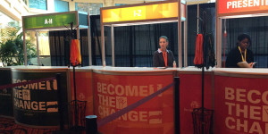
-
- Registration Booth, 2013 National Conference
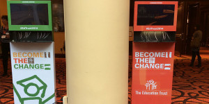
-
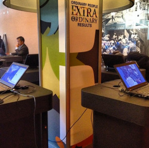
- Cyber cafe, 2013 National Conference
-
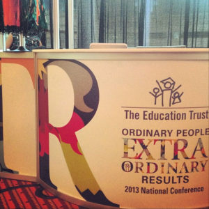
- Registration Booth, 2013 National Conference
-
- Vertical banner, 2013 National Conference
-
- Vertical banner, 2013 National Conference
-
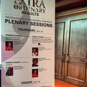
- Signage, 2013 National Conference
Challenge in 2014: Thinking beyond the logo, and start thinking about branding the event
Thinking of Paula Scher‘s useful words, “A visual identity system is the kit of parts that creates a contemporary visual language and makes an identity recognizable. Not just it’s logo.”. I had to take another approach to 2014 conference by thinking beyond the logo, and start thinking about the registration booth, cyber cafe, meter signage, responsive website, program book, giveaways, or any of the unpredictable elements that would need design. I did create the logo, as well as a one color option. But I also restricted the limited color palette we would use. I determined what would be the dominant color, what background layouts would look like, what type choices we would use, all from our own Ed Trust visual system. Once I operated under those parameters we were able to apply conference-related branding to projects we knew were coming (meter signage, website, program book) and others we didn’t see coming (hand sanitizer and charging stations.)
-
- Registration Booth, 2014 National Conference
-
- Charging station, 2014 National Conference
-

- Cyber Cafe, 2014 National Conference
-
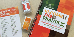
- Program Book, postcards, various handouts, 2014 National Conference
-
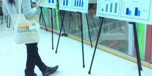
- Tote bag, 2014 National Conference
Date
November 7, 2015
Categories
- Archives
- Environmental Design
- Identity Design
- Signage and Wayfinding