

Oct
Commercial Type | 2015 North American Tour for AIGA DC Design Week

This was the last leg of Commercial Type‘s U.S. trip. Paul could not be attendance, as he had family obligations. But for Chris, this was his last U.S. trip before leaving for Singapore.
Hosted by LivingSocial, Commercial Type was also kind enough to provide us with type specimen books. Those booklets also contained healthy notes in the margins about the historical context of each type. As Chris puts it, we all standing on the shoulders of giants.
-
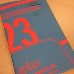
- Free specimen bookk
-
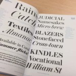
- Type specimens
-
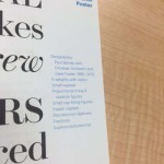
- Notes in the margins
-
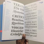
- Type specimens
It was clear Chris was well-seasoned, as his style of delivery was very relaxed, well-paced, and gave us plenty of time to take in the details of the process. My favorite section was the development of the signature typeface for Vanity Fair. He and his team presented an “Old Hollywood” style he was certain they would love. They did not. When he went back to his team to tell them the bad news, he remind them that you can convince anyone to settle for your idea. But you can’t convince anyone to love your idea. He went on to say that we are tasked with coming up with a tool. And if that tool isn’t useful to them, we have to try again.

I’m really glad I got this opportunity. I don’t think I’ll be a full-time typographer. But I will continue to learn from Commercial Type’s techniques. Who knows, one day, I may purchase a type family, and animate for Times Square.
Maybe.
Select photography courtesy of Angela Wolak and Anisha Payne.