

D.C. Metrorail Navigation
D.C. Metrorail Navigation
Description
After reading the description, please take a survey on these proposed concepts.
In an ever-changing metropolitan, redesign the map, signage, and wayfinding systems of the Washington Metropolitan Area Transit Authority (WMATA). Improve how riders navigate both their physical relationship to the subway station and the Washington Metro.
As stated in the brief, it is hard to know where one is located in the city, based on the signs in the system. Recognizing Metrorail has and continues to improve communication systems, both physically and digitally, there is a lot of room for improvement.
Sketches

Map Design | Keep and Combine What Works with Radical Changes
The Metrorail map is becoming increasingly irrelevant. With apps and in-car digital screens shifting to a more linear UX design, the design of the map itself in danger of becoming unhelpful. In matters of urban planning and development, getting new ideas through the approval process is half, if not entirely, the battle. Washington D.C. is no different. Rather than start from scratch, I researched various WMATA maps and stations. I studied what worked about them, and added new solutions to communicate a rather complex system of navigation.
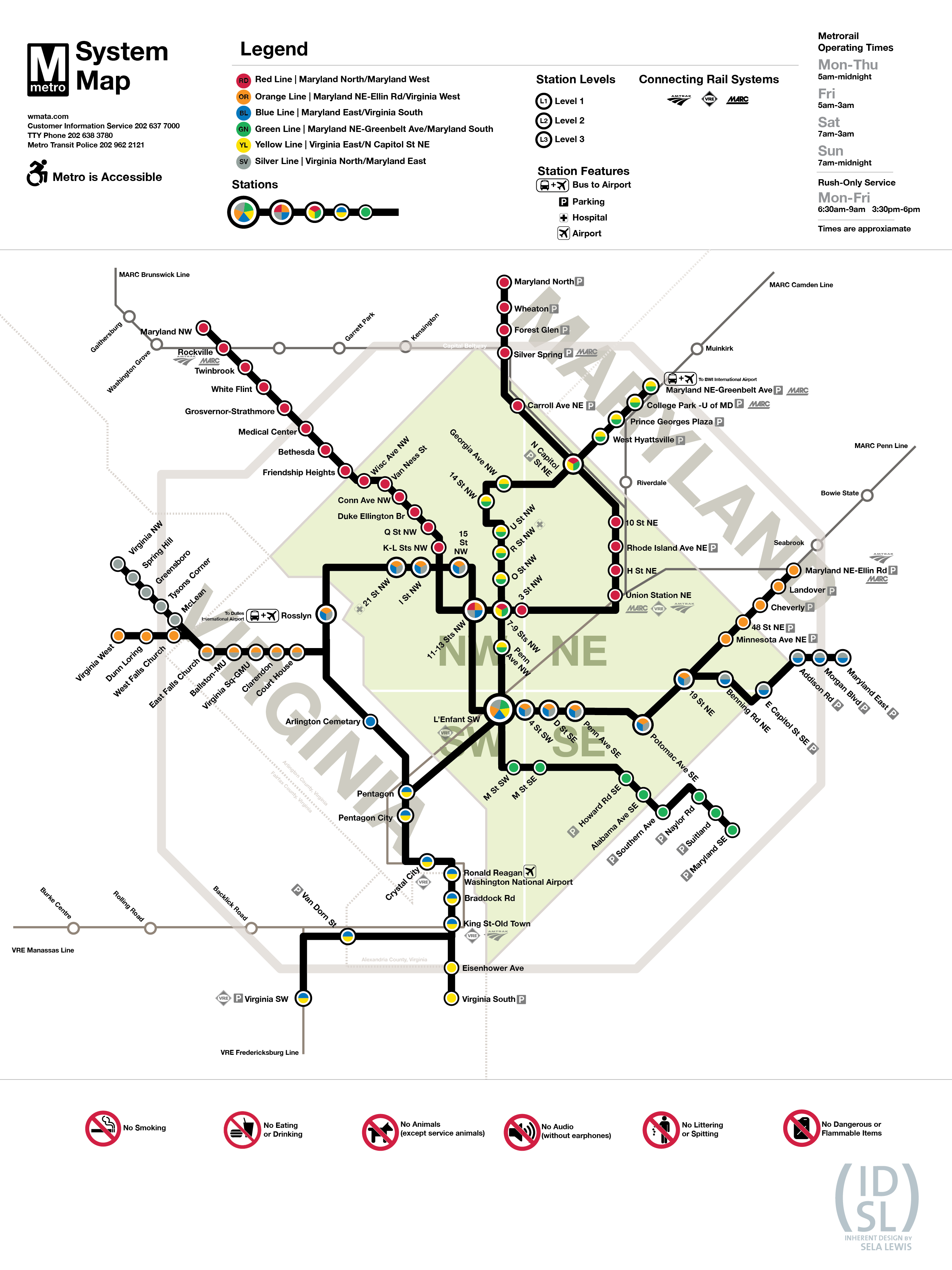
Map Features
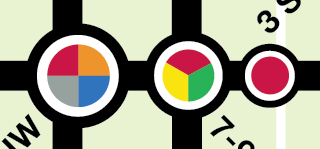
Streamlined Rail Lines
Stations are streamlined, from multi-colored lines that were too bulky, and integrated multicolored circles. This concept is not original. It was lifted and modified from a DC regional map (PDF).
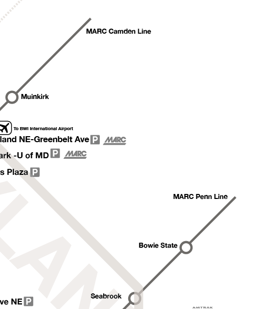
MARC and VRE train lines
The map includes the MARC and VRE stations. This is a commuter area, and that information is relevant. Again, this is not an original idea. This was taken from a map designer who submitted their entry for Greater Greater Washington as a part of their map redesign proposals.
Keep the Vibrant Green, but Reduce Using the Map for Marketing
Planned future stations, waterways (not used by public transit), and icons of the White House and Washington Monument are removed. Those are matters of marketing, not transportation and navigation.
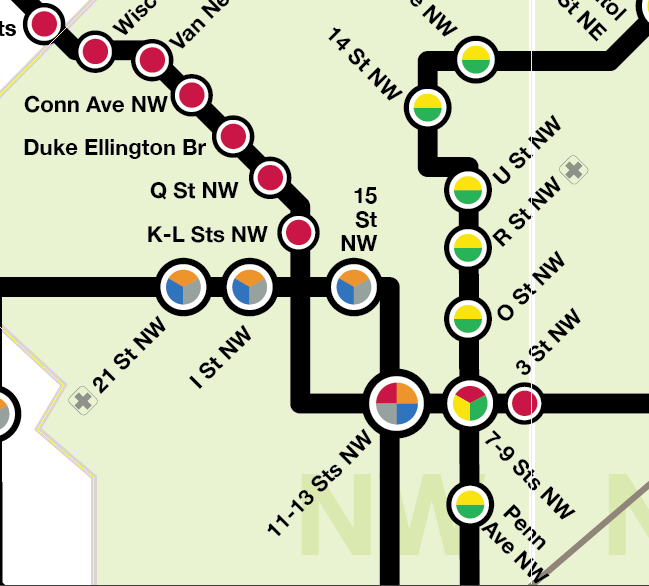
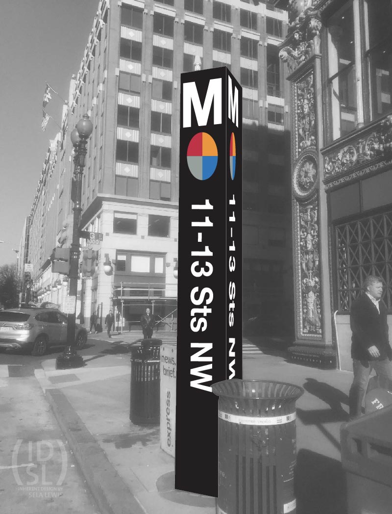
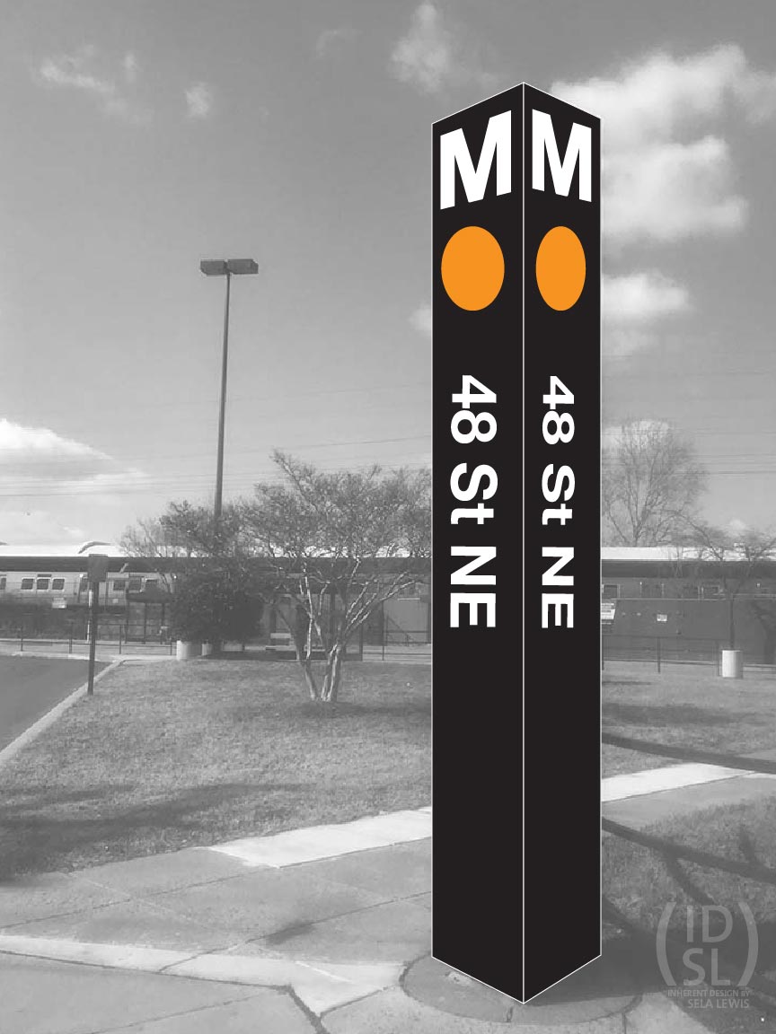
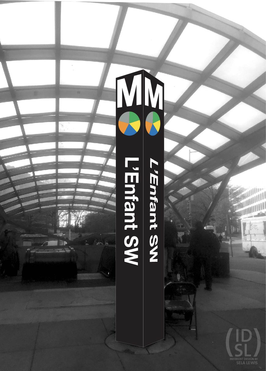
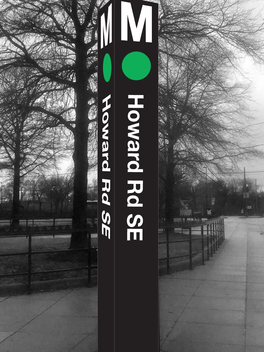
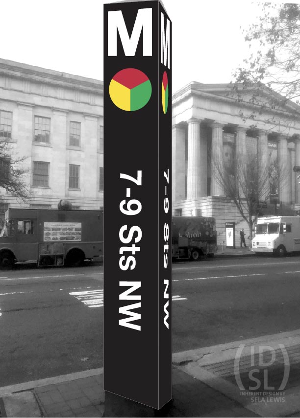
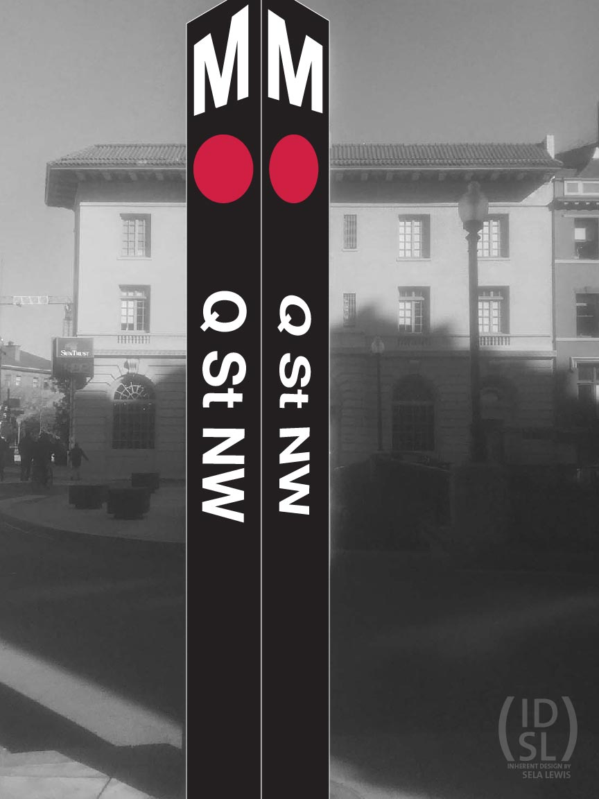
Renamed Stations
What may be considered the biggest change is the names of the stations themselves. There are multiple benefits to changing subway station in the District from neighborhoods to more accurate street signs and quadrants:
- It reframes riders’ final destination to anywhere, rather than a specific neighborhood.
- It informs new riders to the city’s distinctive cardinal directions, and numbering and lettering grid.
- It creates new patterns of navigation for current riders, to adapt to their ever-changing needs.
- It creates an even representation of all quadrants. (More on that here.)
- It eliminates the need to relabel Metro stations with all other Metro stations. If you know where you are, you don’t need to know where you’re going.
There are, of course, generalities with the new names. For example, Q St NW (currently Dupont Circle) also exits at Connecticut Avenue. But renaming a station would be based less on where its located in a neighborhood or one street but based on where the station is located in the city.
Signage and Wayfinding
This system integrates new features of the map, such as multi-colored circular stops representing transfer stations.
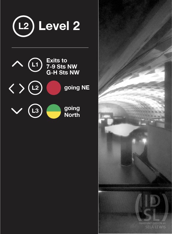
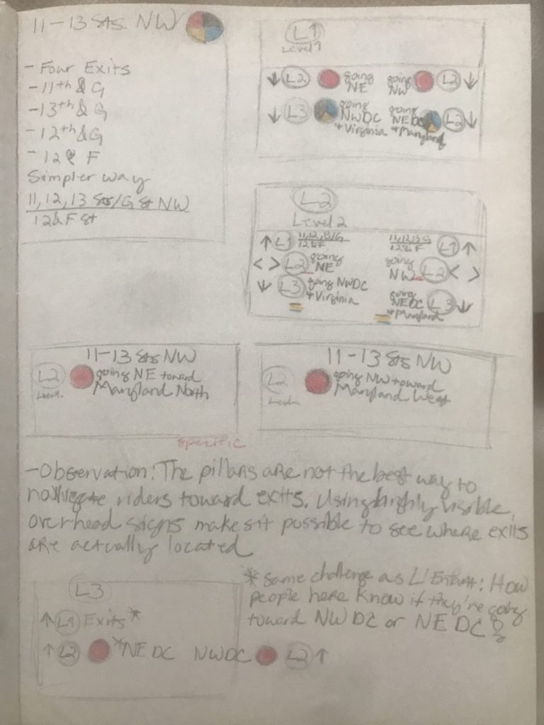
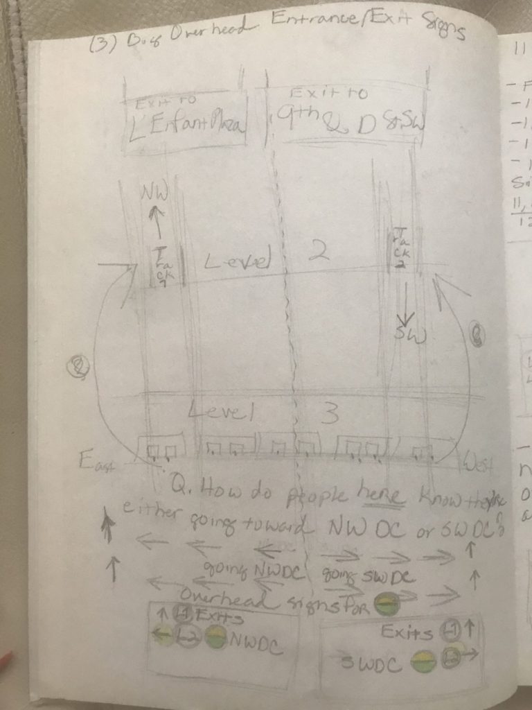
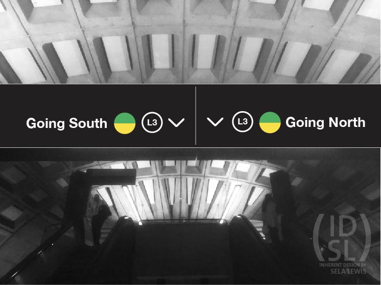
Levels instead of Platforms
Levels are added to stations and introduced in the map. Level 1 (L1), Level 2 (L2), and Level 3 (L3) replace vague directional information such as All Trains, Opposite Platform, Upper Platform, Lower Platform. Articulating stations as levels further clarify where exits are located within stations.
General-to-Specific Information
This signage sequence follows a General >> Specific wayfinding structure. Going from general information such as going SW DC at Level 1 entrances to more specific information the closer riders arrive at a platform.
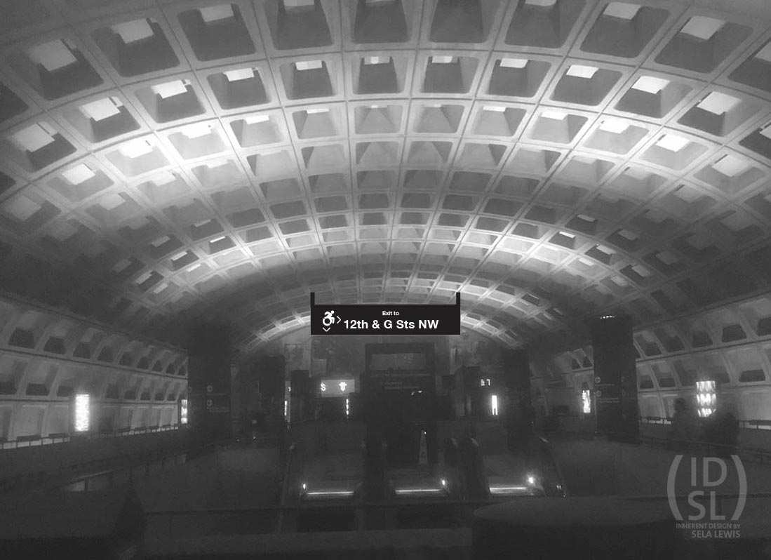
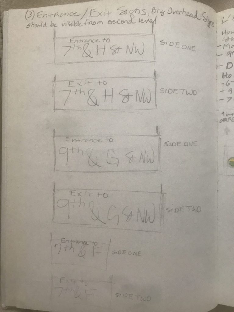
Large Street Exit/Entrance Signs
Station platform and walkways are often filled with hundreds of people at any given moment, especially during rush hour or special events. Pillars are not the best way to help riders navigate to their exit. I suggest several large overhead signs closer to entrances and exits that are visible from great distances, even a platform away. Rather than inching riders along with short arrows at pillars, a combination of shorter and longer arrows indicates to riders how much further they have to go along a platform.
Metro wants to be more accessible to riders. Icons that point toward elevators and escalators placed on platform signs pointing to these pathways should be highly visible above the line of sight. A rider should not have to wait for a platform to clear before knowing which exit to take.
Survey Notes


A Survey
Una encuesta |
Gallery | 7-9 Sts NW
Gallery | 11-13 Sts NW
Gallery | L'Enfant SW
Gallery | Q St NW
Gallery | 48 St NE
Gallery | Howard Rd SE
Date
March 5, 2018
Categories
- Environmental Design
- Service Design
- Signage and Wayfinding
- User Experience
- User Interface
- User Research