Oct
From the Archives | The Education Trust Canvas Bag
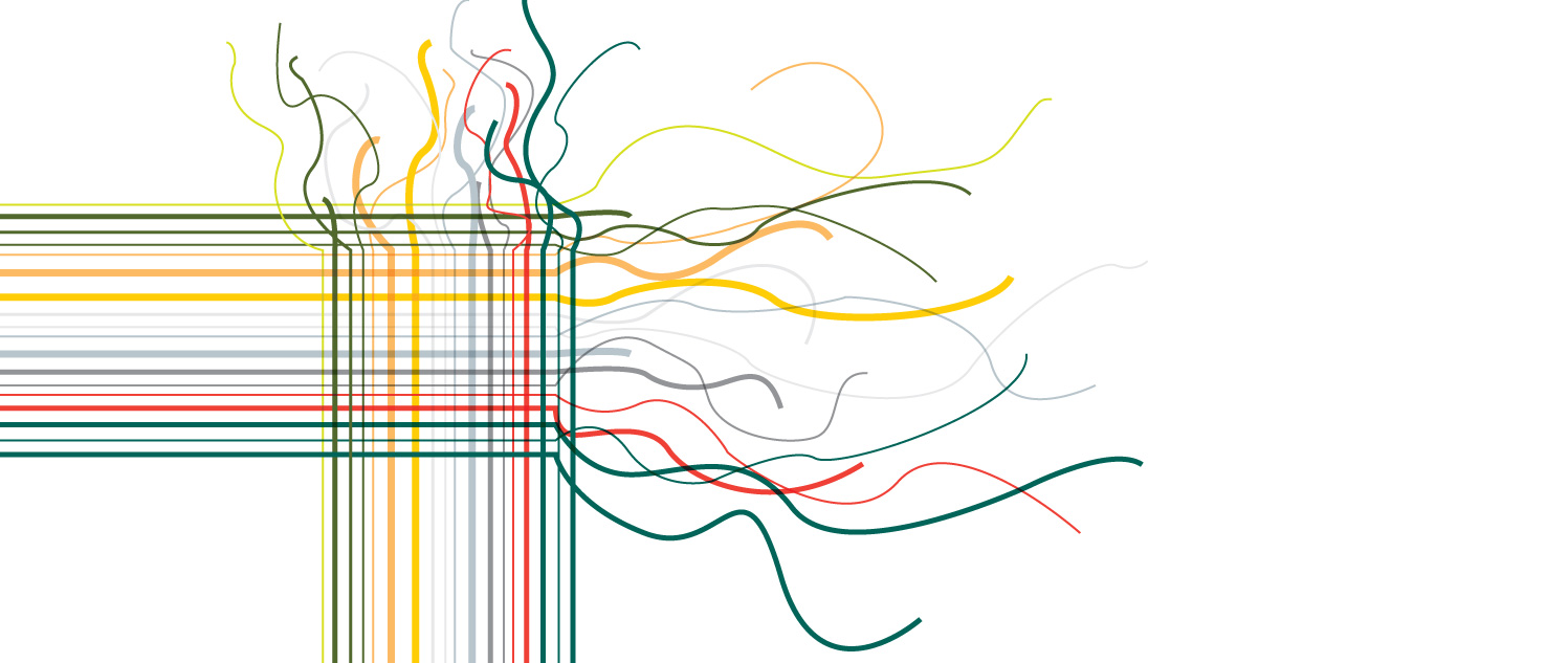
My first year at The Education Trust, I created canvas bag artwork, a giveaway at our national conference.
The Education Trust has a great color palette, but it hasn’t always been used to its potential. When our staff took on this project, we wanted something large-scale, graphic, and meaningful. It was important to show our range of color because, although our work is serious, we are an open, friendly, and optimistic organization.
This bag went through an interesting design, production, and pre-press process. First, it was important to find a quality and affordable manufacturer in the United States. Second, to stay within budget, we had to create a design that was set within an 11” x 17” space. Finally, we had to devise a pre-press solution that would work for our vendor. We used multiple colors and the “multiply” effect in Illustrator for the concept but later discovered the vendor doesn’t do the trapping. To compensate, I imported the artwork from Illustrator into Photoshop and used the magic wand tool to select and separate all the different pieces. Then, I merged the same colors onto one layer and named the layer based on a Pantone color that would ideally match. I went from over 100 layers of pieces to 18 distinct color layers, each one with a unique Pantone label.
That approach initially seemed to work, but our color layers exceeded the vendor’s 10-layer maximum, and adding extra plates would have been too expensive. Consequently, our team decided the most affordable option was a heat transfer of the whole image with no color separations. The quality of the original artwork was not sacrificed, and our organization was able to keep a lid on costs: a true marriage of design integrity and practicality.
I submitted this for Print Magazine’s Regional Design Annual 2012. It didn’t get selected, but it continues to be a popular piece.


