

Jul
Trump-Pence and Our Modern Logo Obsession
[responsivevoice_button voice=”UK English Female” buttontext=”Listen to Post”]
We are all a little too logo-obsessed.
I find this in my own work. Someone will approach me and say,
I want to host an event, I need a new logo.
I’m starting my own business, I need a new logo.
I want to start a website that talks about XYZ, I need a new logo.
Here’s the kicker, y’all. Not everything needs a new logo.
How did we get to a place where everyone — including the announcement of a vice presidential candidate — needs a logo?
A Brief History on Modern U.S. Political Campaigning
U.S. political campaigns began to get really savvy about marketing to voters around the early 1960s. With more televisions coming into more and more homes, the visibility of the candidate mattered more than ever. A key turning point was the airing of the first political debate between John F. Kennedy Jr. and Richard M. Nixon. Kennedy, who had just come back from vacation and spent days preparing and resting for the debate, was in stark contrast to Nixon. Nixon, who was barely functioning with a head cold, and campaigning late in the evening, seemed exhausted, old, and overwhelmed next to Kennedy. In Rick Perlstein’s Nixonland: The Rise of a President and the Fracturing of America, he details the impact that airing had on the public’s perception of both candidates:
Kennedy styled himself the very incarnation of youth: of action, of charisma, of passion, risk-taking, stylishness and idealism and even heedlessness. Nixon, so recently the fair-haired boy of postwar politics — only four years older than Kennedy! — had let himself become the race’s rumpled old man. At the ballot box it was almost a tie. On television, in retrospect, it looked as if John F. Kennedy had won in a landslide.
After falling out of the political limelight for several years, Nixon consulted Madison Ave. ad agency J. Walter Thompson to redevelop his public political persona. Eventually, H.R. Haldeman and Ron Ziegler, former executives of JWT, would go on to work for Nixon in the White House (and become notoriously associated with the Watergate scandal.)
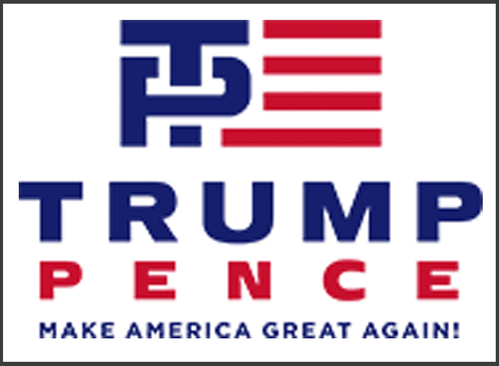
”It's rare for a political campaign to create a whole new logo when a vice president is chosen.
Branding, Beyond the Logo
Like Nixon, more people are becoming aware of the impact their image reflects their personal and professional goals. Part of that is the logo’s impact on their company’s visual identity and professional face. But people are confusing logos with brand development. Just as Kennedy and Nixon shaped our ideas of a modern political candidate, the people who frame our perceptions of a candidate speak to the brand more than a logo. As graphic designer Michael Bierut so elegantly put it the logo is empty vessels, and what you house in it is what matters; it’s not all-encompassing.
Video: What makes a great logo?
And I’ve learned this in my own work. I developed the branding for The Education Trust’s national conference for three years. Over time, I learned that it wasn’t about the logo. It was about the event; as it is marketed and experienced from the time it is first announced to the time one attends, to the time one leaves.
Given the long shelf life required of a brand, what is it about this shift for Trump’s campaign?
A Critique of the New ‘Logo’
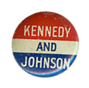
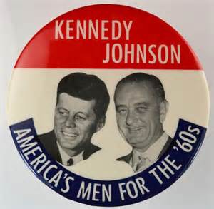
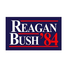
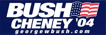
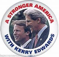
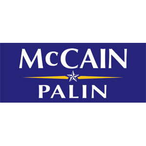
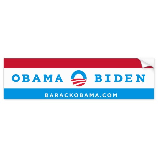
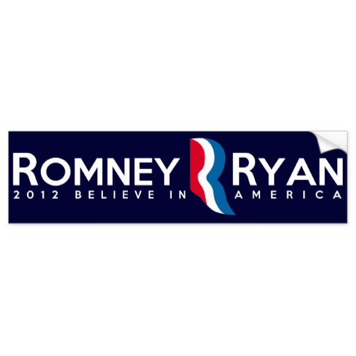
Scatological and sexually suggestive humor aside, I critique the Trump-Pence logo within our familiar lexicon of president-vice president branding. The gallery above notes various political campaigns, from both major political parties, dating back to the 1960s. In each example, some variation of red, white, or blue is used. And in each example, both last names are used; either side-by-side, evenly-weighted, or the presidential nominee’s name is slightly larger. Trump-Pence falls along with those traditions. But what makes it stand apart is the interlocking letterforms forming alongside red and white stripes. This part is the symbol. The last names “Trump Pence” below it would be considered a lettermark. When letterforms and symbols are combined, they create the logo.
It’s rare for a political campaign to create a whole new logo when a vice president is chosen. What are the Trump campaign implications going forward? Are they signaling that this is a new campaign, therefore a new kind of candidate? There have been rumors swirling around that Trump is very different in front of major Party donors, than the bombastic, eccentric, hyperbolic candidate we the voting public get. If so, this could be signs of a more sober, self-modulated candidate. But this is where it backfires.
Donald Trump’s popularity is based on his rebelliousness. He says the things nobody wants to say out loud, and that appeals to people. But his use of traditional red, white, and blue colors, and his traditional lettermark usage suggests he might not be as rebellious as he’d like us to think.
”Just as Kennedy and Nixon shaped our ideas of a modern political candidate, the people who frame our perceptions of a candidate speak to the brand more than a logo.
When in Doubt, Put A Logo On It!
But maybe it goes back to my earlier point: We are all too logo obsessed. We like to tell ourselves that putting a new logo on something makes it stand out, and gives it credibility. But that’s not how branding works. If you already have a good product with clear goals, the logo should not be what makes up for its shortcomings. If you are planning an event — even more than one — it’s about the event, not the logo. If you plan to write a blog, focus on your content, theme development, and communications strategy; not the logo.
My job as a graphic designer is to help people solve visual communications problems. The form that solution takes depends on your goals, your audience, the many contexts under which it will be communicated. The solution is often not a logo.
For Trump-Pence, this symbol was not necessary. He could’ve taken his existing Trump branding with the white lettermark on blue background, and simply added Pence’s name below his. To date, they seem to have figured this out as well. I don’t know if any new campaign branding will mark a shift in Donald Trump’s candidacy. In the sage words of Katy Perry, time will be the ultimate truth teller. But I do know that, in the history of political campaigns, he didn’t have to deviate far to move forward.